I can’t lie, it feels a bit surreal being here again. I’m sure as Steadfast’s full production becomes a normal part of my life, it will feel more a part of me than it does an ethereal experience of creative expression. That being said, Chapter Two - Namesake is by far my favorite chapter. I’d also like to think that I accomplished everything I set out to do with it. As I’m beginning this Chapter Epilogue, I’m not sure if I have much to say about the development of the chapter, but we’ll see.
Development
Backdrops, Sets and Environments
The single most time consuming aspect of this chapter, and presumably the entire project going forward are the background assets. Much like many other artists, background art has never interested me much. I have never been particularly good at it either, to be honest. Thanks to this project, I am getting plenty of practice. However, ironically, the process I use has me creating far more to a scene than is ever shown on the page.
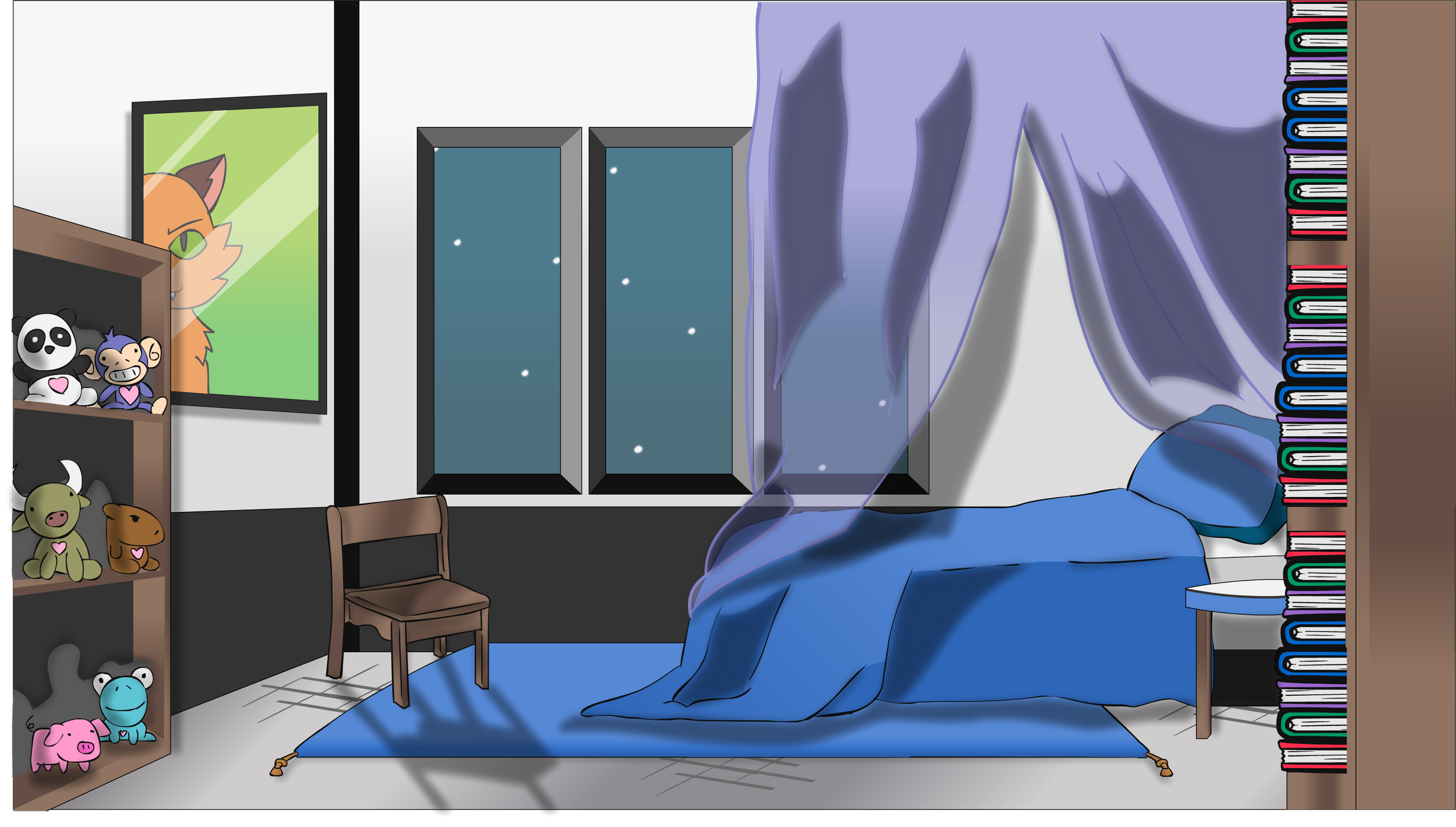
Riley’s Room
This was the first proper set of the chapter, and I only really showed the bed and the bookcase full of Heartland plushies. Two of which are light references to Aipom and Froakie from Pokémon. The real meat is the poster on the wall that’s a parody cover of Warriors by Erin Hunter. A series I’ve never read, but one of my proofreaders suggested as a title Riley may like to read. It also has a character named Lionheart in it.
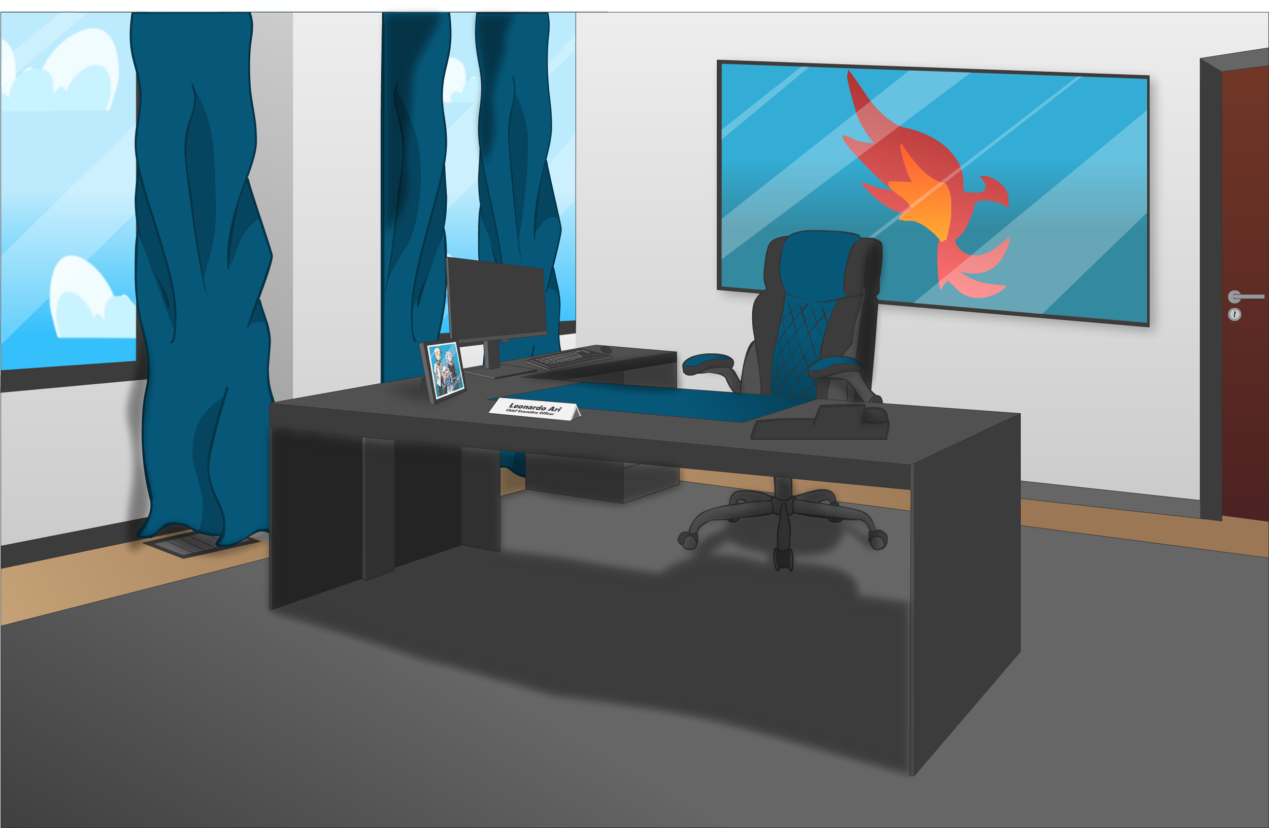
Pride Foundation - Leo’s Office
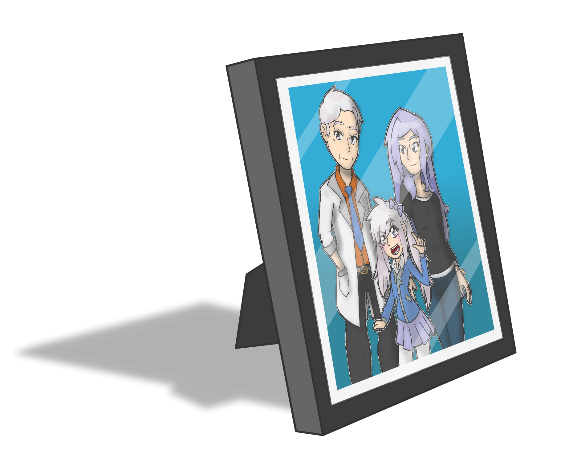
This set ironically took the longest, I’m pretty sure. It was about two and a half hours. One of my favorite details I added was the Ari family photo on his desk. It shows Leo’s dad for the first time, but the more interesting thing about it is that this is the first time I’ve drawn him before the death of Riley and Phoenix.
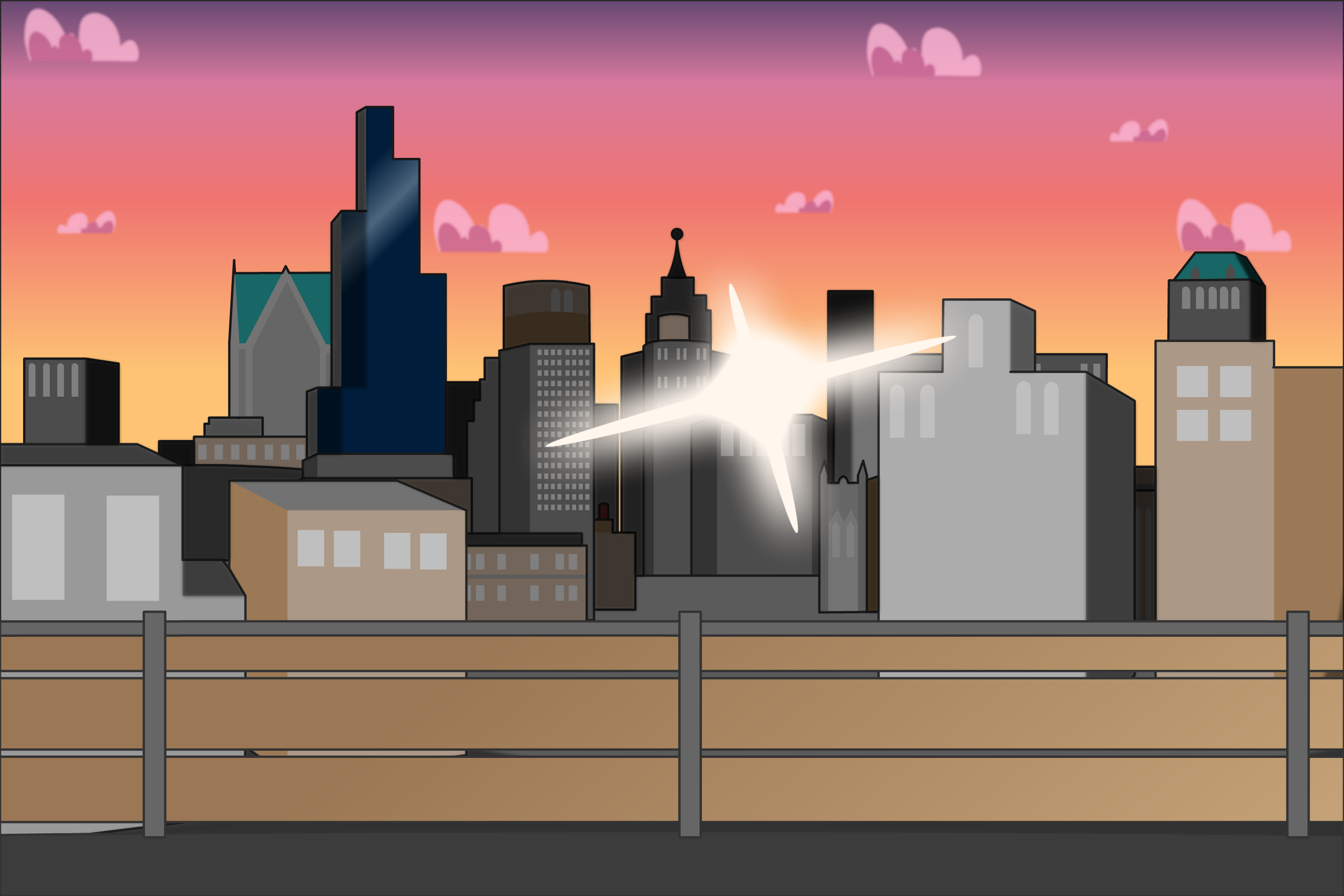
Lion’s Den - Balcony (Dusk)
This set didn’t take as long as expected, honestly. Which was a relied as cityscapes are dreadfully dull for me to draw. I’m just really happy the framing and lighting turned out as intended, because I consider it among the top three of the most important scenes in the entire first book.
Steadfast Legion War Room
There’s not really much to say about this location. It’s the main strategy room for the Steadfast Legion. Figuring out the colors for this room was a bit challenging, though. The palette I settled on suggested high technological advancement, which I enjoy as I intend to highlight the tech difference between MidKnight and Lionheart later on.
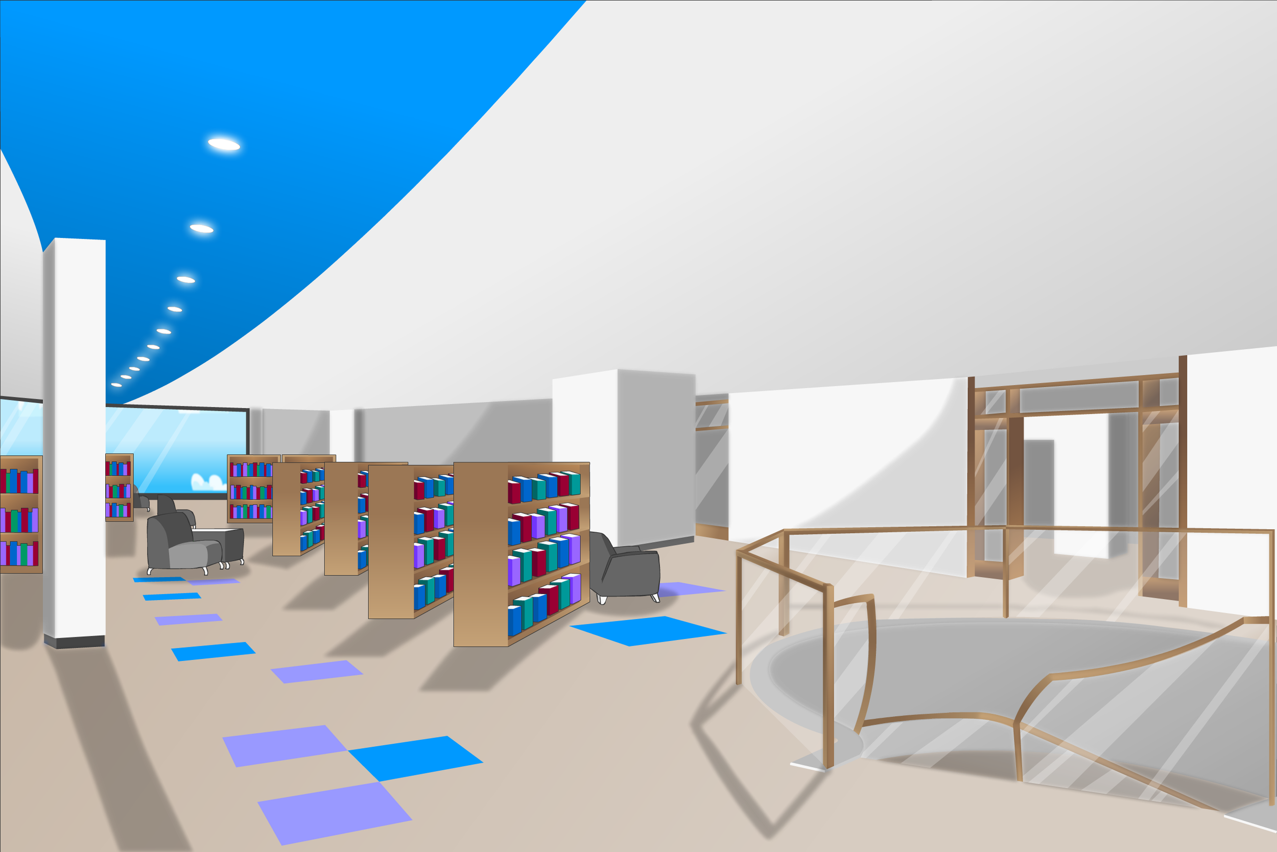

Public Library (Interior Floor 2)
This set makes me laugh. So much work and detail for it to only really appear on one page. I don’t regret the work I spent on it, but you don’t even see the blue streak on the ceiling in the actual chapter lol. Riley’s favorite place to be deserves TLC though.
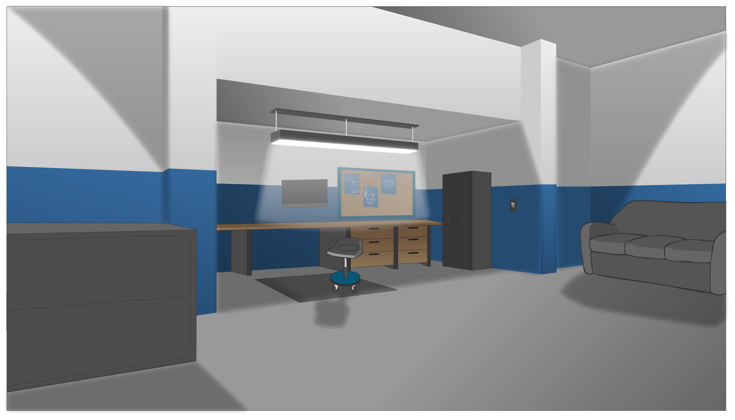
Leo’s Room
This set was fun to do. It really challenged me on perspective. I think the most amusing thing is that the raw asset shows night time outside, but the actual use of it depicts an early morning. The one thing that I hope came across best is that the portrait of the Hero on the floor used to be hanging right above and is now covered in dust…dust is kinda hard to draw.
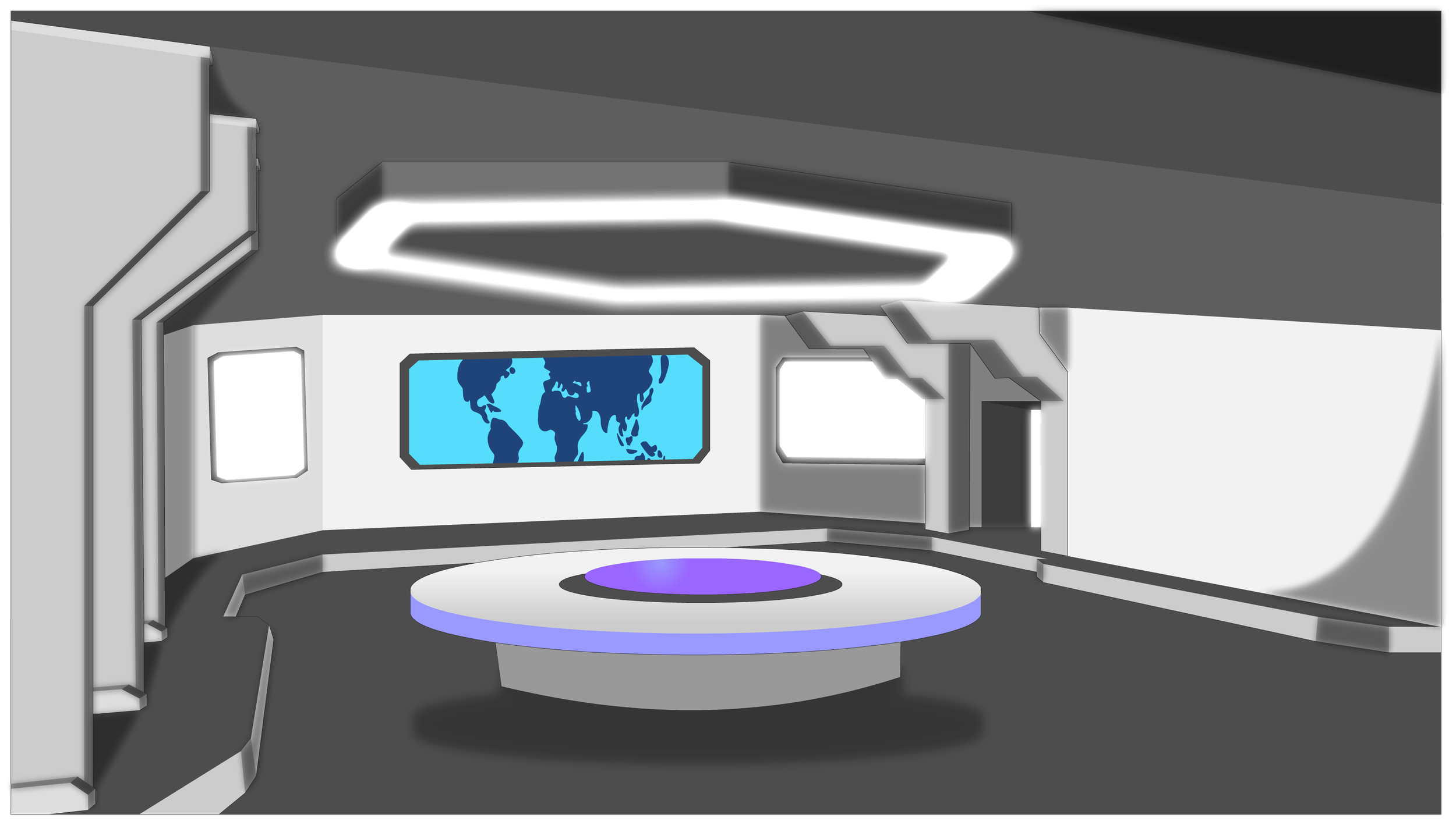
Lion’s Den (Interior)
This is where the magic happens! I left it intentionally barebones as Leo doesn’t really know what he’s doing. I intend to have it expand and get messier as the story progresses and Mia gets further engulfed in her work.
Additional Information
There’s not nearly as much to say about chapter two as the first since it’s not responsible for starting the entire universe. I do appreciate the slower pacing of this chapter compared to chapter one’s breakneck pace. That being said, I have a couple of Easter eggs, additional lore, and designs to talk about to end things off.
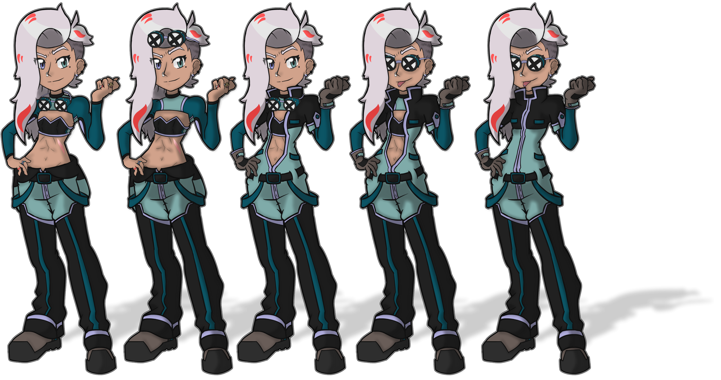
Mia’s Mechanic Suit
Mia’s appearance at the end of the chapter is the first time we get to see her in her suit that she wears at work and as a hobbyist. Chapter two doesn’t really give a great look at it, so I figured I’d show it off here.
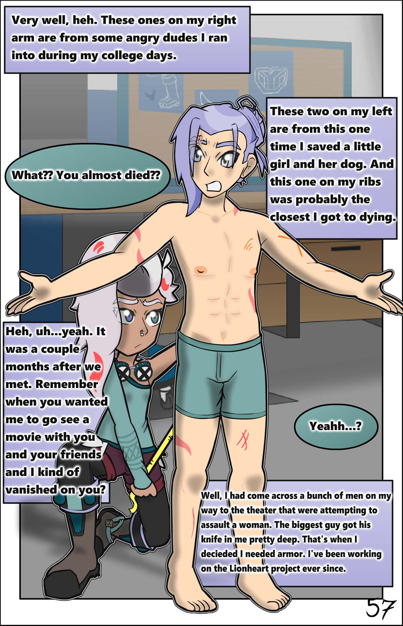
Text Layering
A new visual quirk I had to develop was layering text and text boxes differently because of Page 57. I really, really did not want to compromise on this page’s composition, but I ran out of room for dialogue. So, I decided to play around with it and got this unique look. This image here is how the page originally looked upon publishing, but due to confusing read order of dialogue, I have since swapped two of the text boxes.
Heartland Plushies
This is something we’ll explore in later chapters, but something that was cut from the initial draft of chapter two was that the plushies Riley collects are a pop culture craze of ultra-cute gacha-like plushies that have a gimmick of nametags. You get to write whatever name you want on their stomach like Andy did from Toy Story. I had a line alluding to this before, but it felt unnatural and I decided to save this development for later.
Easter Eggs
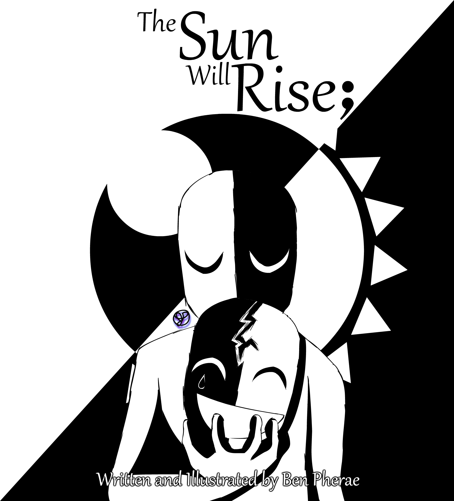
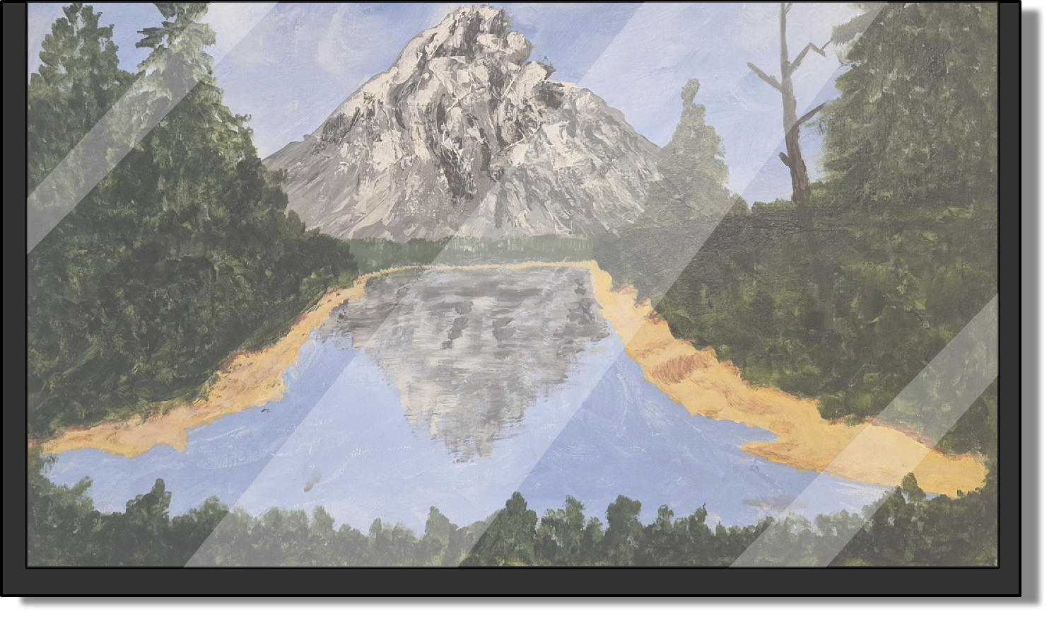
On the first page (Page 40) you can see a poster for another one of my books, the Sun Will Rise;, as well as a canvas behind Phoenix. This canvas was painted by my later grandfather and felt like it was a nice thing to put in for some more set dressing.

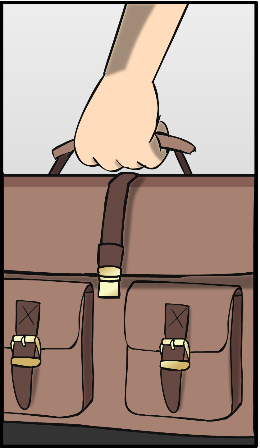

The shirt Leo is wearing in the last few pages is the same one Tony Stark wears in Iron Man 3. And the bag Leo uses daily is one I own in real life.


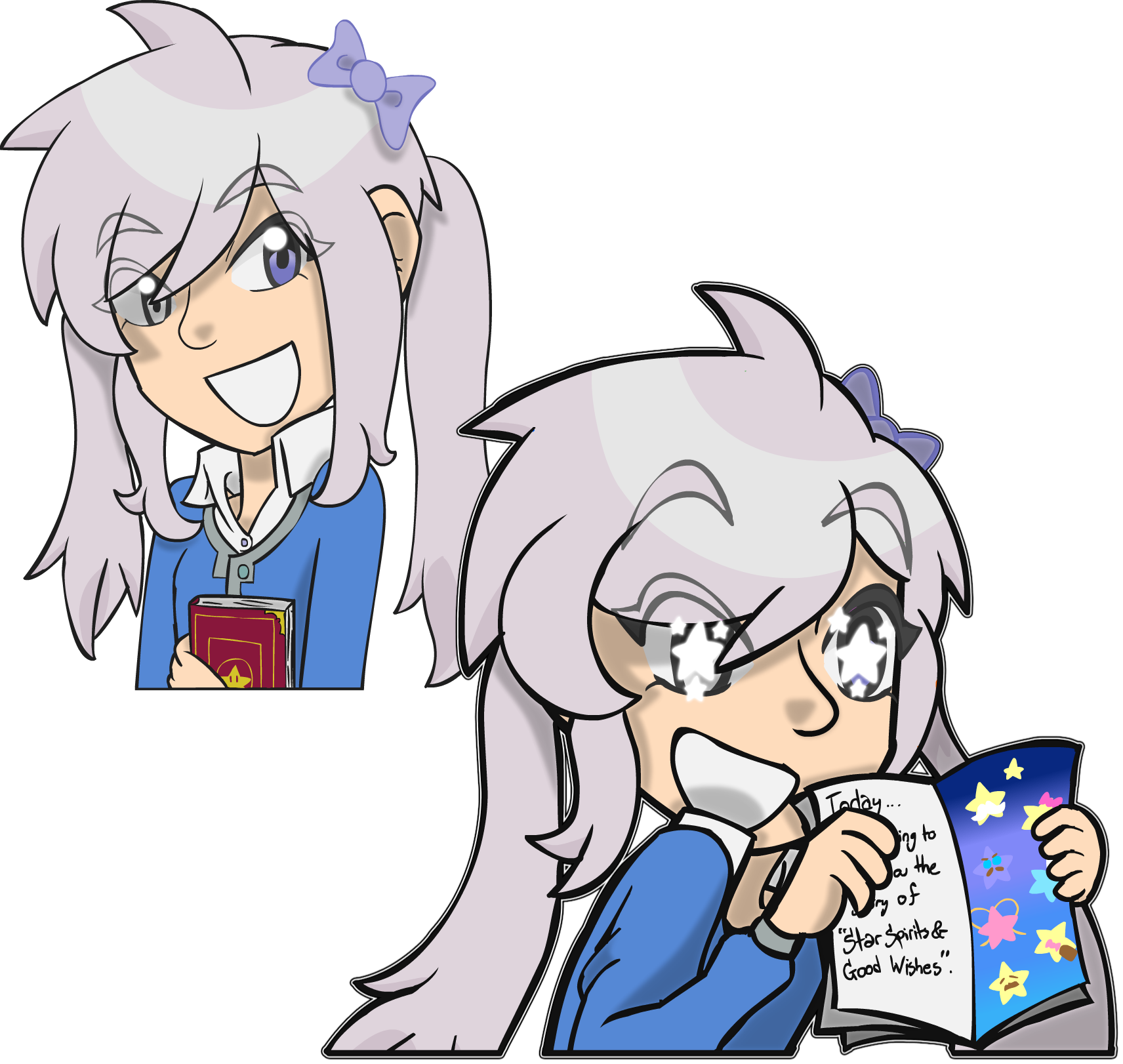
Mia is seen a few times throughout this chapter in a few alternate art styles. However, whenever anyone appears in this style, it is my main art style. It is also the one that will be used for Hi-Technical.