Want to revisit the Teaser for Steadfast Book 1 - Lionheart (Chapter 1: Those Left Behind)?
It is now available here! Click the thumbnail to see Steadfast in its earliest stages!
Hey all! Welcome to the first of many Chapter Epilogue pages! After every Chapter concludes you can check here for various things like behind the scenes assets, making of screenshots, notes, things I’ve changed, and my general thoughts about what I’m aiming for with this project. This is generally just an interesting insight type of tool for anyone interested in the way I’m doing things. Additionally, limited time events like the Chapter One Teaser will be moved to pages like this instead of the Home Page to keep things organized. I’d also recommend checking back in on the pages for your favorite Chapters because there is a high likelihood I’ll be adding to old ones as time goes on.
Fair Warning: These Epilogues will be best viewed on Desktop browsers rather than Mobile.
Pre-Development
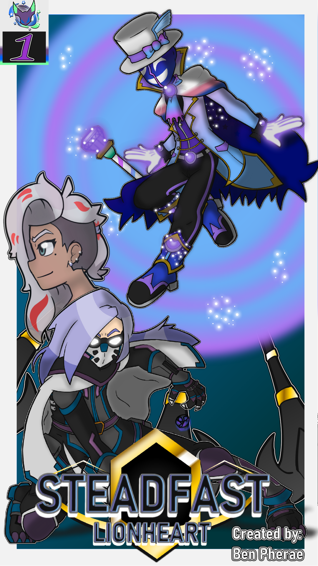
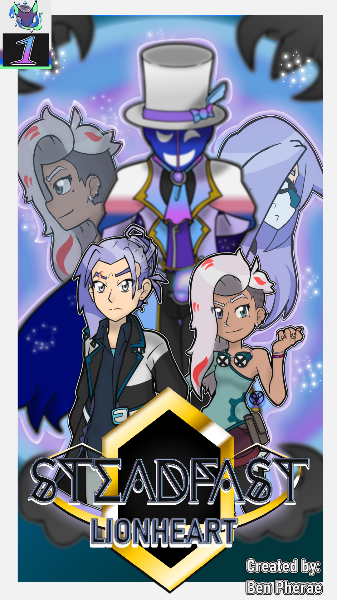
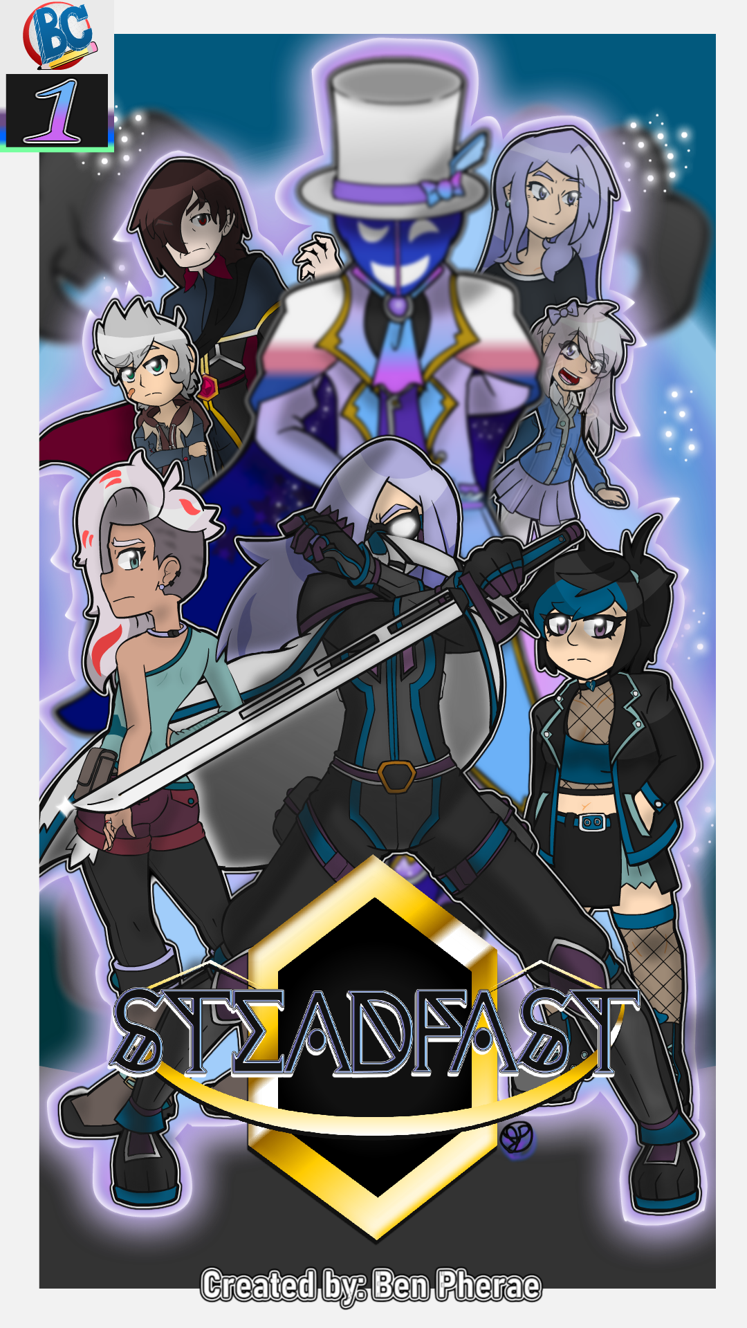
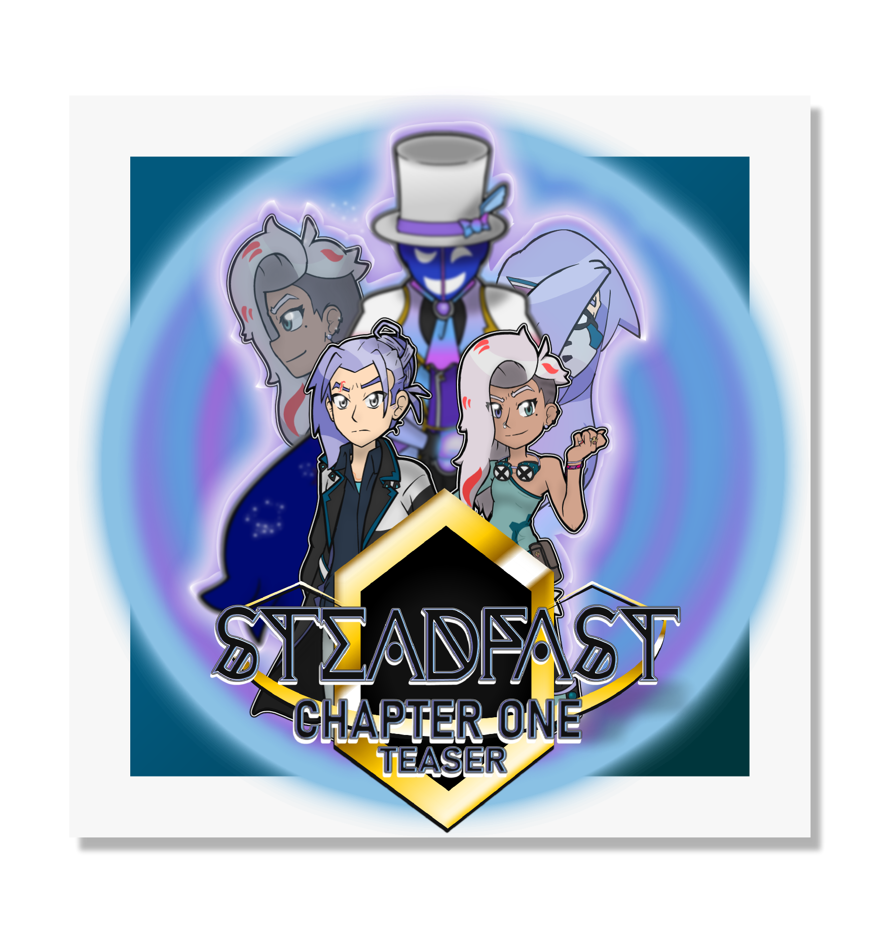
The evolution process of the Book 1 Cover was pretty interesting, in my opinion. The first one was just a slap dash edit of pre-existing character renders arranged to make it seem enticing without having to put that much effort into it. As time went on, with Revision 2, I had a general idea of what I wanted out of it, but I still used a lot of pre-existing assets that weren’t meant for this piece at all. It still felt like it was minimum effort, despite the new character outline that came out of it that I very much enjoyed. The 2026 Final Revision is, yet again, composed of pre-existing assets, but their use here makes a lot more sense in the context of a book cover. The Lionheart render was made as a texture test originally, but after adjusting it to fit the more minimalist design of his suit, it made sense for a centerpiece. Especially since Lionheart himself wasn’t really on the cover of his self-titled book in Revision 2. The most interesting bit, to me, is that Mia render was originally planned for the very early drafts of this cover, but I could never quite nail the pose. I ended up trying again to celebrate Pride 2025 and nailed it. Below is the earliest draft of the cover.
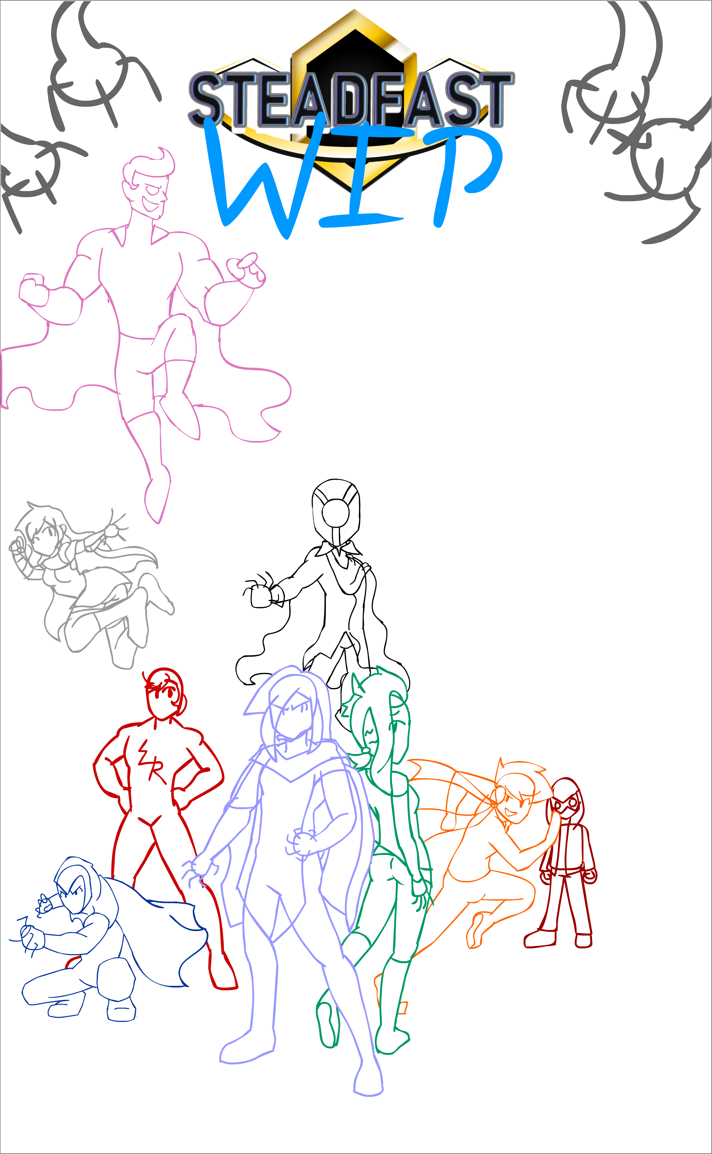
If you’ve been following the development of Steadfast, you may have seen this image before. It does have two characters that will not make any appearance whatsoever in Book 1, and it also features a supremely old design for a Hero called Lightningrod that we’ll be meeting in the future. This was back when his design was substantially different, and I reused his original idea for Isaac.
One of my favorite things to talk about in regards to the development of Steadfast is the origin of certain characters and the progression from initial development to what is seen in the final drafts. Unfortunately, most of the most interesting ones (in my opinion) are going to be saved for later chapters, but I can at least share four today.
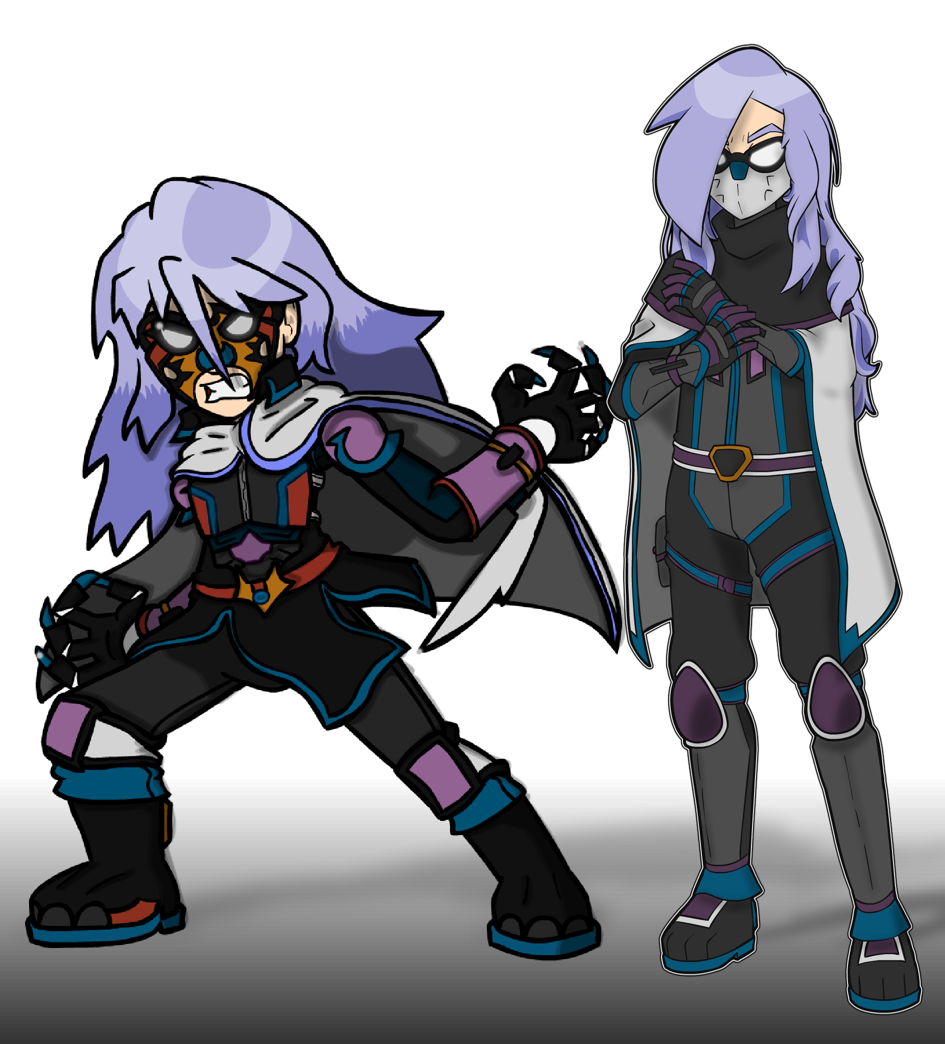
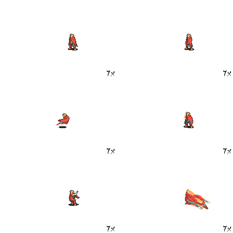
Lionheart’s development as a protagonist started based off the Thief Sprite from Fire Emblem 6. It’s solely the reason Steadfast’s development took as long as it did. The name Lionheart comes from a song from my favorite band, Lionheart by Blind Guardian. A lot of their songs actually inspire many book titles or chapter titles.
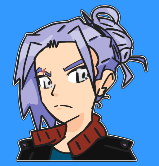
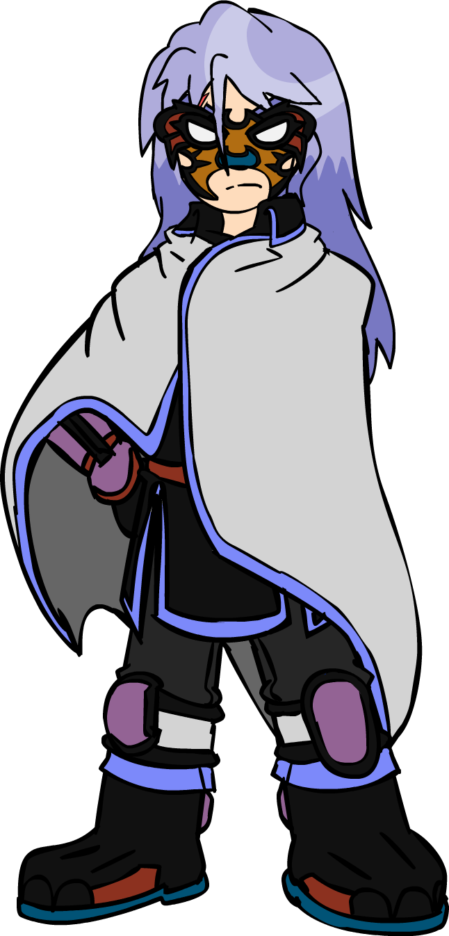
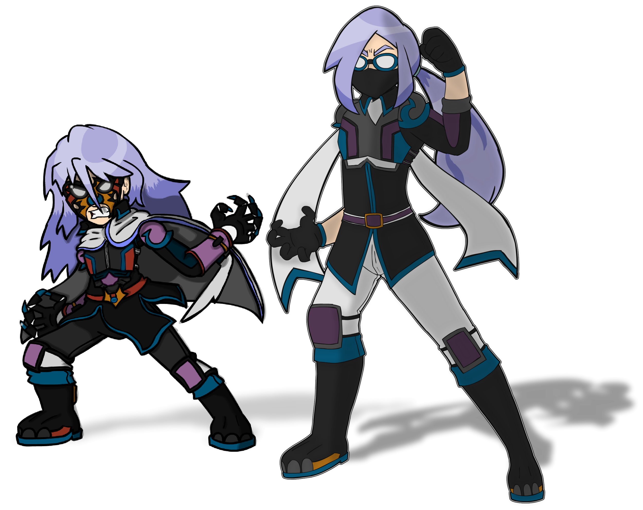
As you can see, the design for Leo’s civilian appearance and Hero appearance were quite the struggle. I also had to carve out a new art style in the middle of this as I did not want Steadfast in my main style. I ended up playing with different colors of outlines, using a softer black than pure like I usually do. I originally wanted to do something more angular as well as seen in the top left image, which was loosely inspired off the art style from Azure Striker Gunvolt. The same basic ideas carried throughout. I ended up dropping the Roy (Fire Emblem) inspired look for the suit in favor of something more original and I accidentally came up with a suit that loosely resembles a Lion’s face. There’s also obvious Black Panther inspiration with the claws and the Pokémon Gallade for the arm blades.
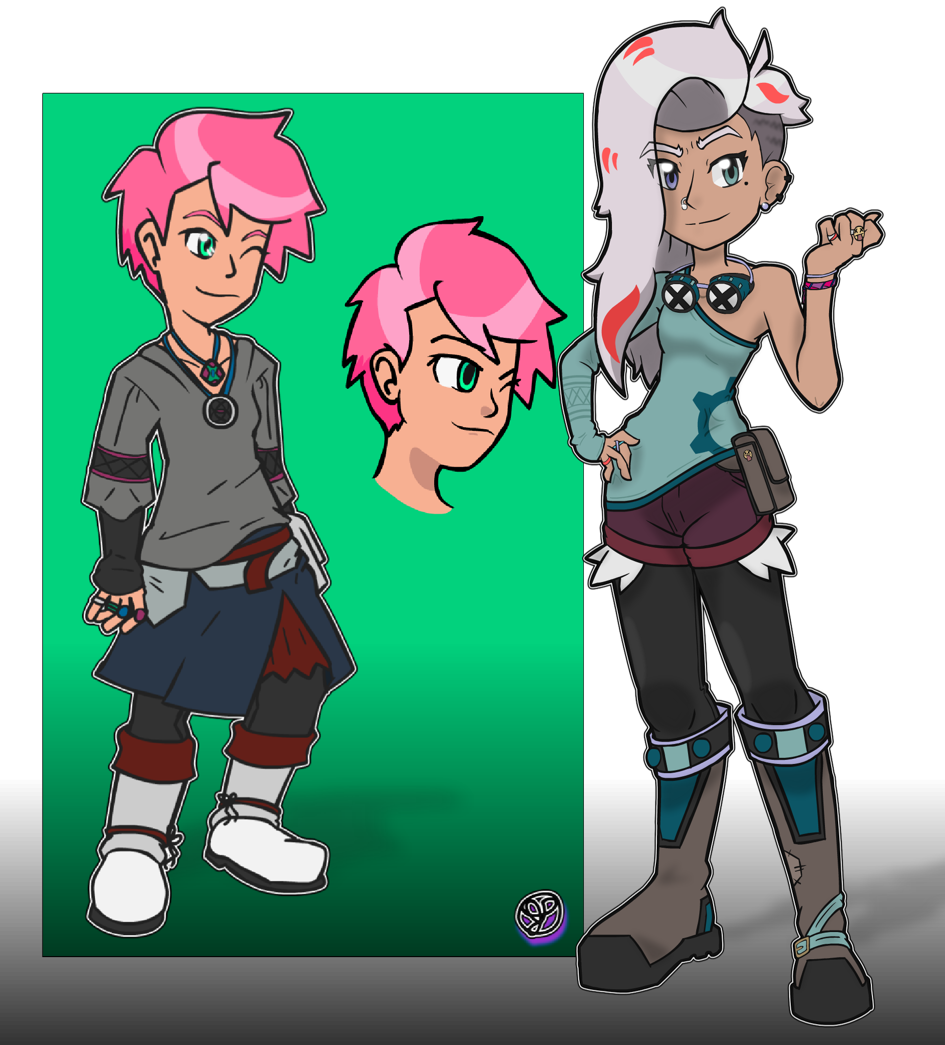
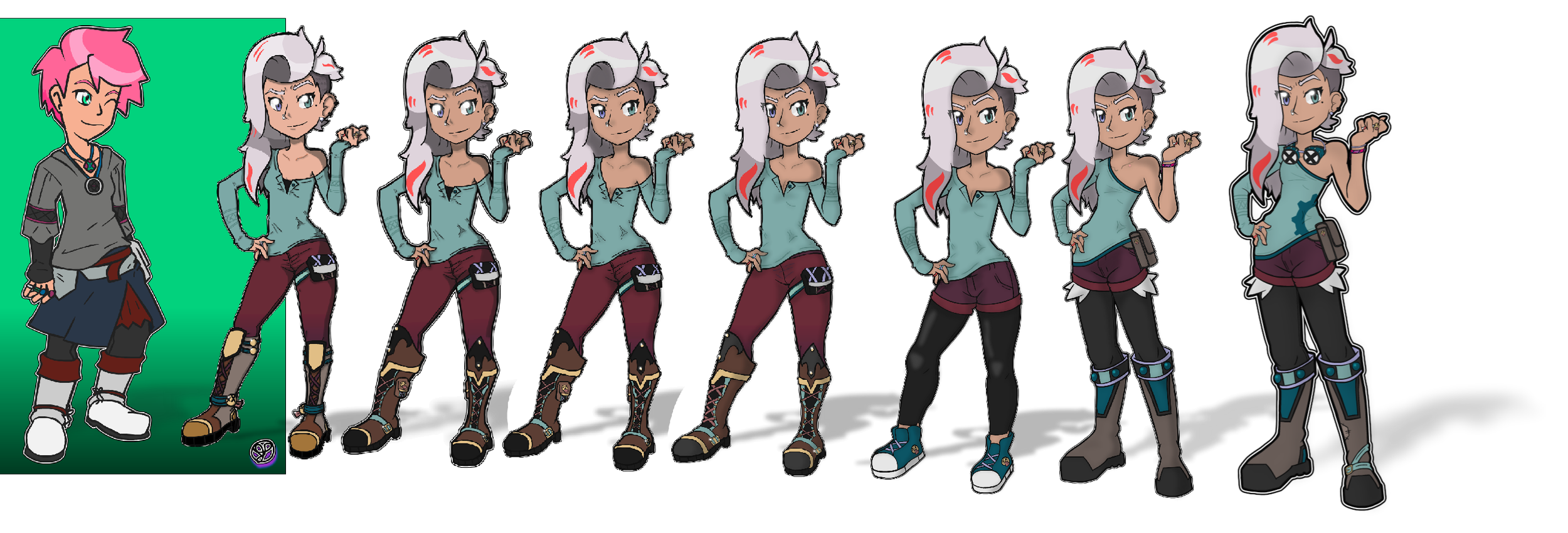
Mia’s development as a character is one of my favorites to talk about. There aren’t a whole lot of particular inspirations for her outside of the Trainer May from Pokémon for her shorts and the character Pascal from Tales of Graces f for the hair color. The initial concept for Mia was to design a very attractive female character using a wide majority of traits I do not personally find attractive. Jokes on me, because despite that test, I find Mia to be extremely attractive.
One of my favorite attributes about her that only improved as time went on is how good of a study in asymmetry her design is. While her outfit was originally very steampunk in design back when she had short pink hair, I kept that sort of theming when molding her into a mechanical engineer. Breaking up her outfit into smaller chunks, adding shorts, chopping a sleeve off, and adding stylized boots was a very iterative process. I loved the second to final look so much, but it felt like it was missing a little extra oomph. That’s when I realized welder’s goggles would look great, and while the gear on her shirt is a bit on the nose, it rounds out the asymmetry in her design quite well. Definitely one of my crowning achievements as a designer.
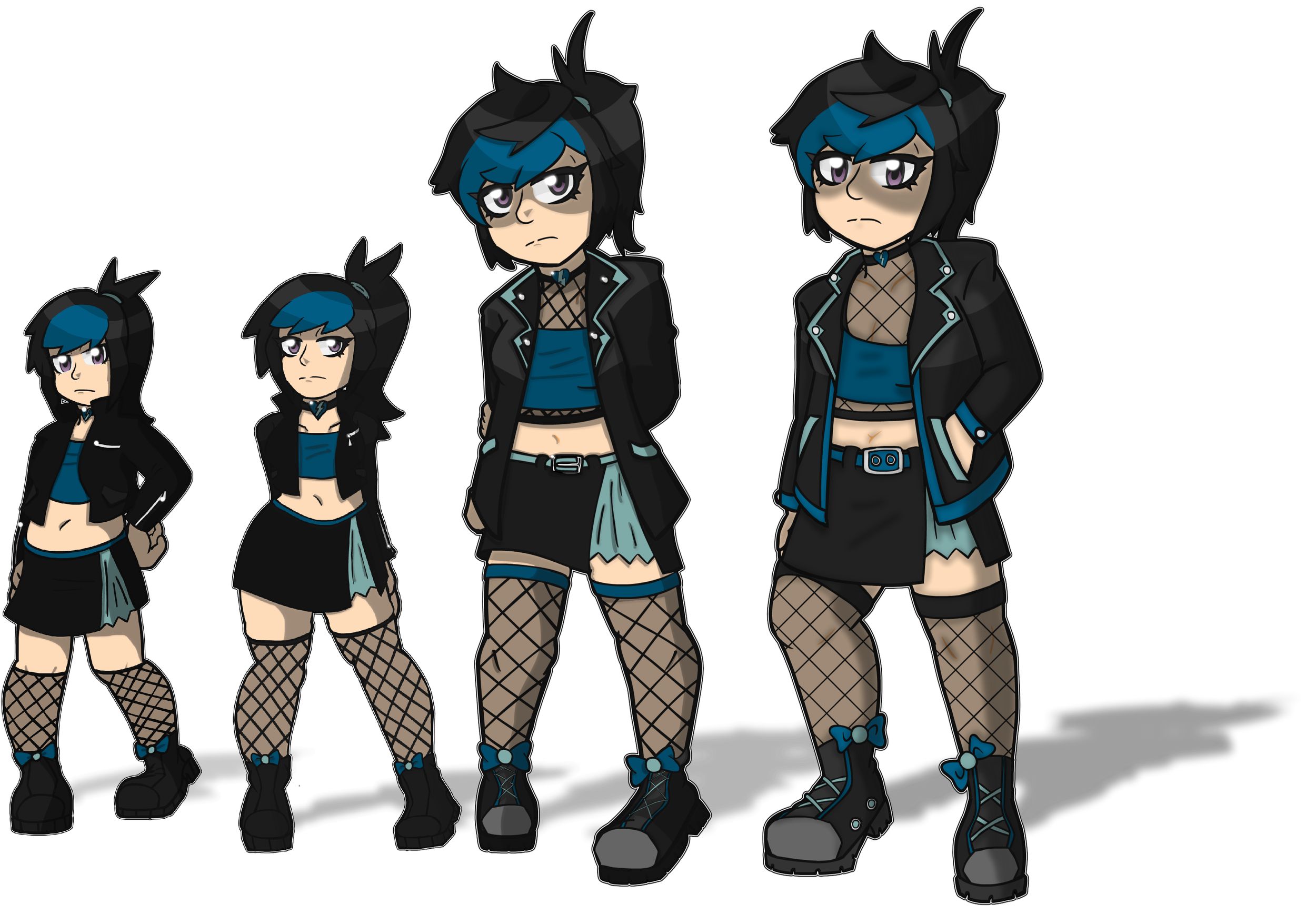
Charley’s development is something that was born more out of necessity than an original vision. Diversity is something that was extremely important to me when creating Steadfast. While she does fill the role of lesbian representation, I also wanted to make sure that she was plus sized, as representation for larger people is sparse at best in fiction. It took me far too long to get a handle on her proportions, but in the end, I think it was worthwhile.
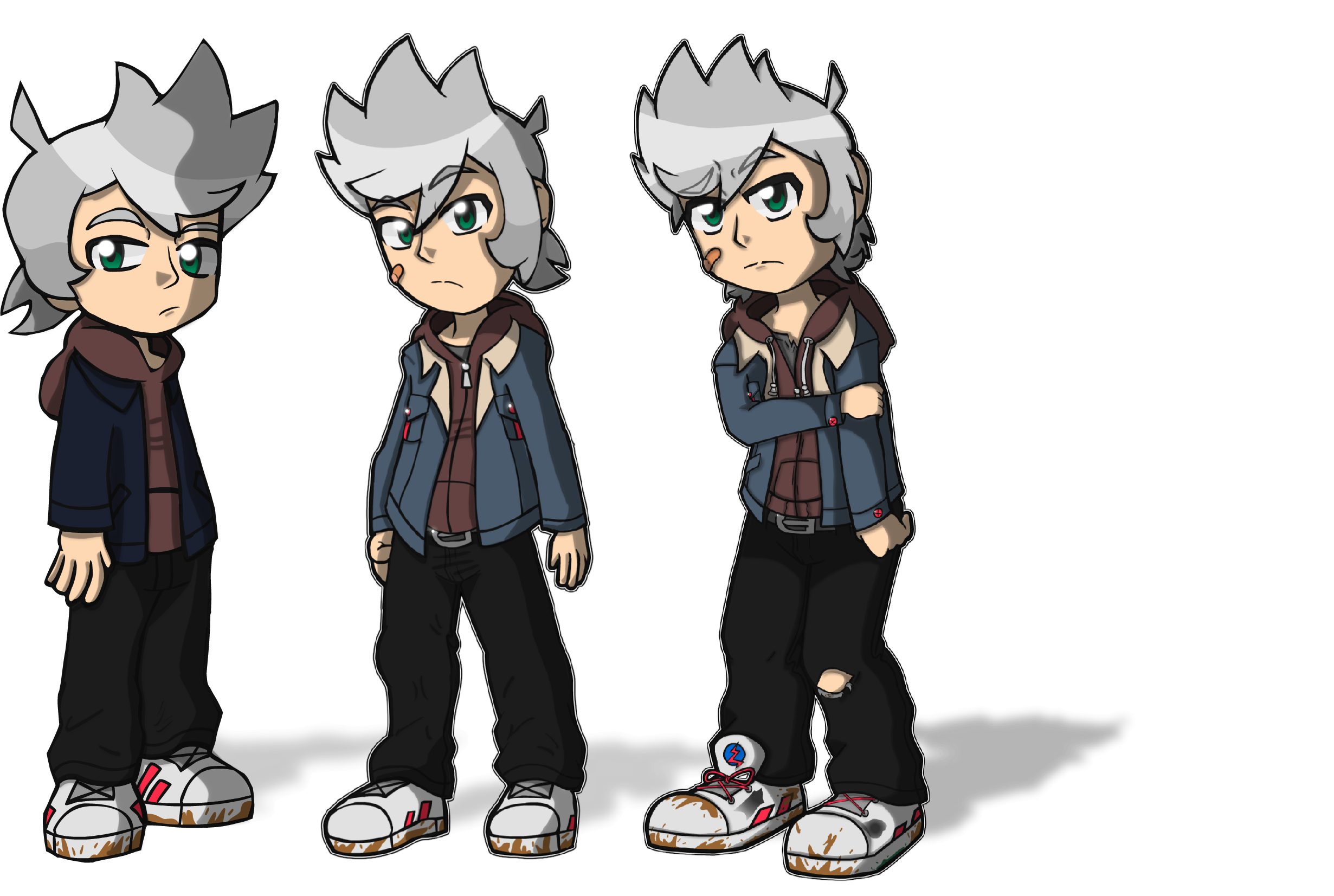
Isaac is the last important character worth talking about for Chapter 1. The most interesting thing about him, I think, is that his design is essentially repurposed. He was originally going to be the look of a different Hero I’ve yet to reveal. Isaac’s importance will be a slow drip feed throughout Steadfast, but I urge everyone to keep an eye on him.

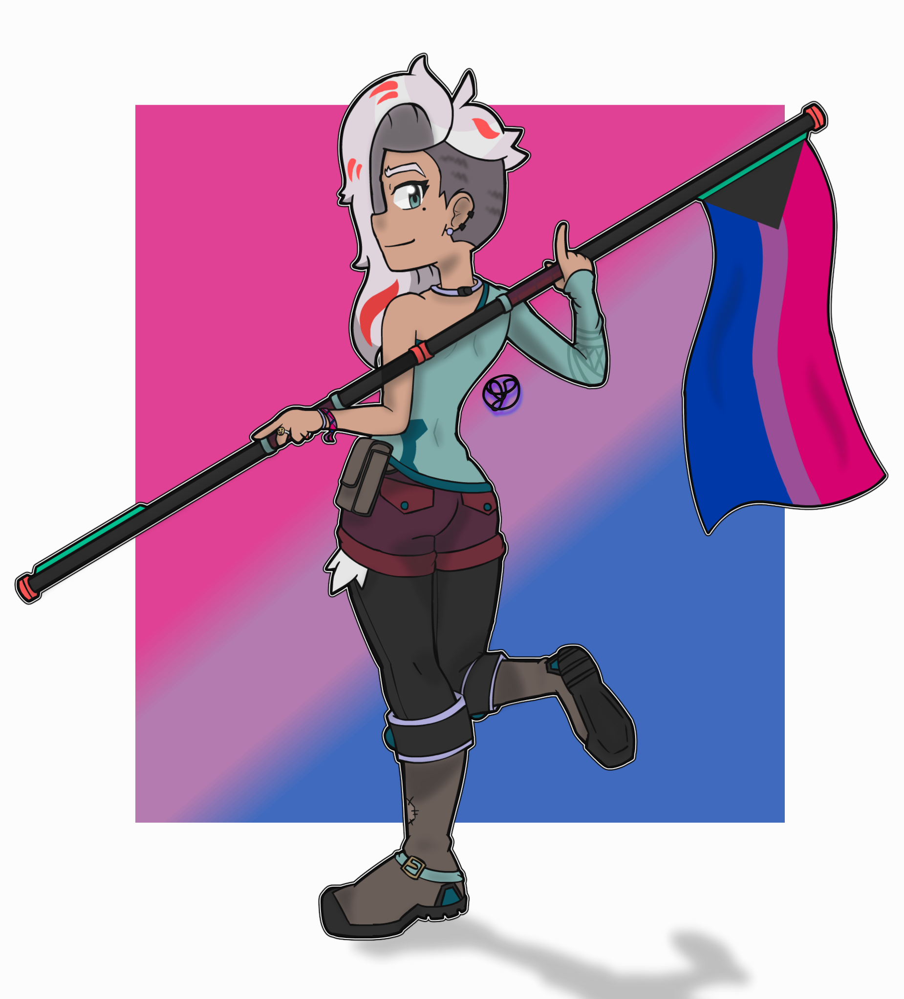
I know that Steadfast is still young. It’s been a lot of behind-the-scenes work for me, so it feels like it’s been around forever, but the public finally gets to see it. I’m pouring my heart and soul into this project, and it means so much to me that so many people are already interested. I’m thinking that upon the conclusion of each book, I’ll post the scripts for each chapter in the finale epilogue for that book, but I’m not sure. I suppose the most important thing I want to discuss is the nature of Mia’s sexuality, and I know that is going to sound so incredibly jarring at this point.
Author Thoughts
Mia was always intended to be bisexual. Ever since her very first conception, that was always going to be the case. A few months after her first white hair design was completed, I realized that I, too, am bisexual. Not only that, I am demiromantic as well. For those who may not understand what that means, a demiromantic bisexual is someone who can fall in love with anyone regardless of gender, but it requires an incredibly strong emotional attachment beforehand. There is a lot of discourse in media discussion about bi-erasure and what it means to pair off supposed bisexual characters into a heterosexual presenting relationship. Likewise, there is a lot of discourse about having a bisexual woman date a woman just to get with a man later to “turn her straight”.
I hope these concerns will be quelled with Steadfast. Charley was created solely, initially, to give Mia a female love interest despite my intent for a will they won’t they with Leo. I am well aware about what representation like this means and how it has been treated in the past. I hope that knowing where I lie with my sexuality will help fellow bicons rejoice in this representation instead of the same old we’re used to.
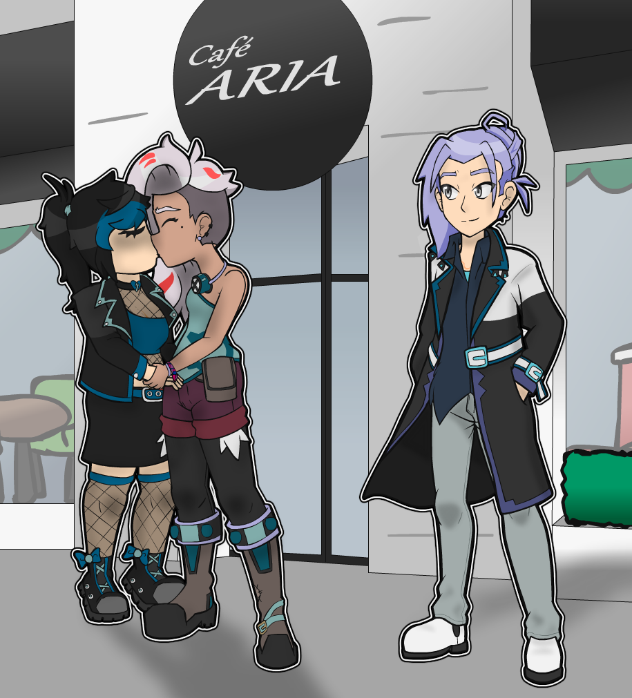
A good example, I think, is that on Page 32, I have Mia and Charley kiss before Mia’s Night Out. This was not done for fan service, nor was it done for some disgusting sense of sexualizing lesbians. The original script for this scene had Mia hugging Leo instead which just did not make sense following the context of that scene. It fits larger narrative intent, but harms the short term goals of things. I bring this up as an example of ways I’ll be looking out for bisexual representation more than any other during this story.
It also led to a last minute complete rewrite of Chapter 1’s finale, as it was going to be a more traditional damsel in distress style moment. However, I did not want Mia to appear weak and Leo to appear like a traditional Hero in a routinely misogynist situation.